Even better UI: Scrivener – The Corkboard
Scrivener is an excellent application and the closest anything has come to a great word processor (as opposed to a page layout application, which is what most word processors really are). Fiction and non-fiction writers alike love it, and I fully recommend it for writing anything longer than a blog post. But it’s so full of functionality and customisation options that it can be a bit unintuitive at times. So here are a few ideas for improvements.
The Corkboard
The corkboard is probably one of the main reasons why so many people like Scrivener. There are two modes:
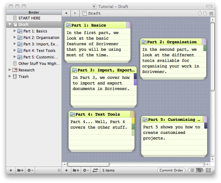
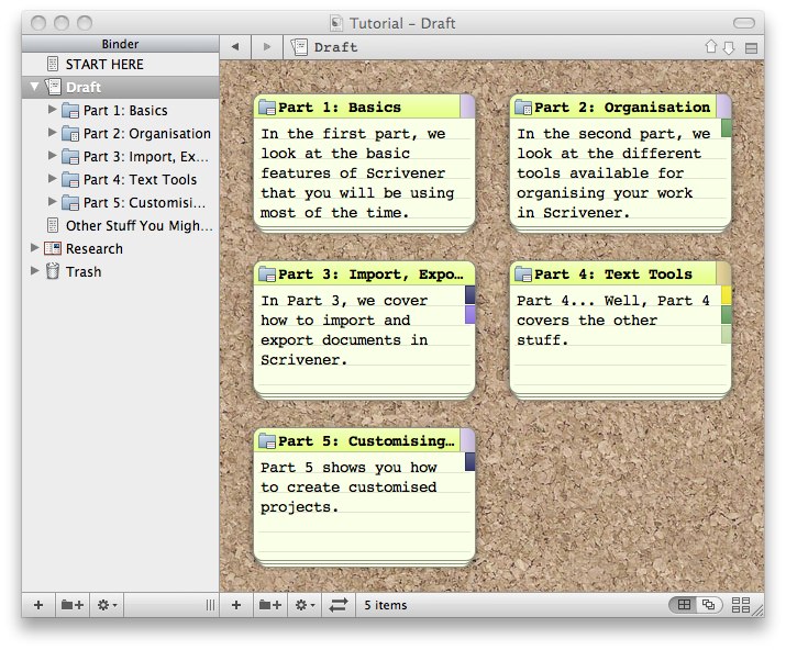
Each card can represent as much text as you want, which sounds obvious, but sadly isn’t. This feature is particularly welcome when writing screenplays.
Customisation
Scrivener is very customisable. This is good news for a program you’re likely to spend a lot of time in. The problem is, the options seem a bit… scattered. The corkboard, for example, is customised in 4 different places:
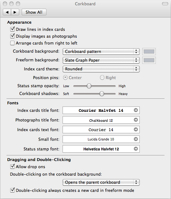
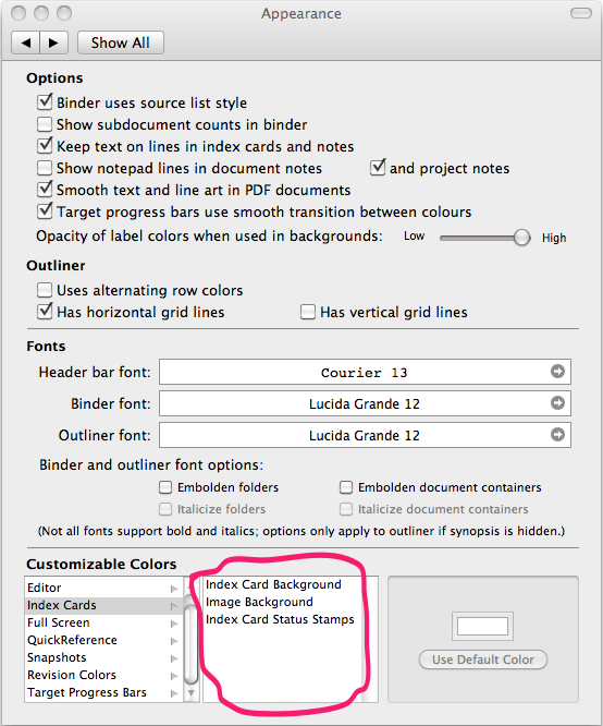
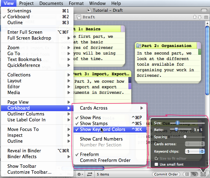
I couldn’t find the option to show keyword colours as chips on each card, I just happened upon it while searching for something else. You can already set the number of keyboard chips to display on each card (bottom right corner of the screenshot above). Adding the option “None” to the list would make it a lot easier to find, and wouldn’t even take up any screen space. It would also make it impossible to set “Keyword chips” to 5 and still not see any chips, something I initially thought was a bug.
The label of each card is shown by the small coloured square in the top right corner, but when you have many cards and many keyword chips on each card it doesn’t exactly stand out. It would be much easier to get an overview of the labels if the colour of the label was used for the title or maybe even the whole card.
Edit: the helpful people over at the Scrivener forum informed me that it is indeed possible to set the colour of the card to the colour of the label. Just go to View Menu – Use Label Colour In – Index Cards.
Freeform
The freeform corkboard is excellent for getting your different ideas in order, but it would be nice to be able to group different cards together by dragging one next to another and have it automatically snap into place. This would also stop me from wasting time trying to align the cards just right, and instead force me to find better ways to procrastinate. Or write something. Whichever seems possible at the time.
 TextSmith
Blog
Comments